I’ve noticed in Roast.World when viewing on my iPad Pro (iPadOS 15.5) or Surface 6 (Windows 10), that the Bean ROR line is off compared to how Roast.Time displays it. Has anyone else experienced this? I’ve only noticed it in the last week. Not sure if it’s a bug or if I have inadvertently done something to cause it to display that way. image|689x376
Yes! I posted this earlier and thought it was displaying celsius but it is definitely off from degrees F per minute.
Not sure what is happening specifically but the zero line seems to be indexed somewhere in the area of the P/D/F events. However the lines seem to originate at the bottom of the graph, so there may be a couple issues involving the Y1 & Y2 graph origins being overlayed by P/D/F events.
Bruce
Hi @coffeethatrocks and @geoffrey, can you both please provide a screenshots of the expected look of the graph on RT vs how it’s showing on RW? A link to the profile will also help. I’m not 100% sure I understand the bug here. This will help me recreate the issue so that I can fix it.
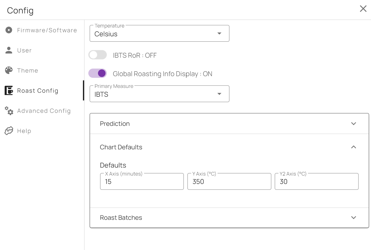
Alternatively @coffeethatrocks, can you log into RoasTime and see what your chart defaults are set to? It seems like the values are set unnecessarily too high for the y and y2 axis. I think the highest for y should be around 350c. The y2 looks to be way too high. I’d recommend changing this to a lower value.
But if it’s related to how the bean RoR line is drawn, this might be related to the difference between the graph heights in RW and RT.
Thanks,
Derrick
Thanks for the help Derrick
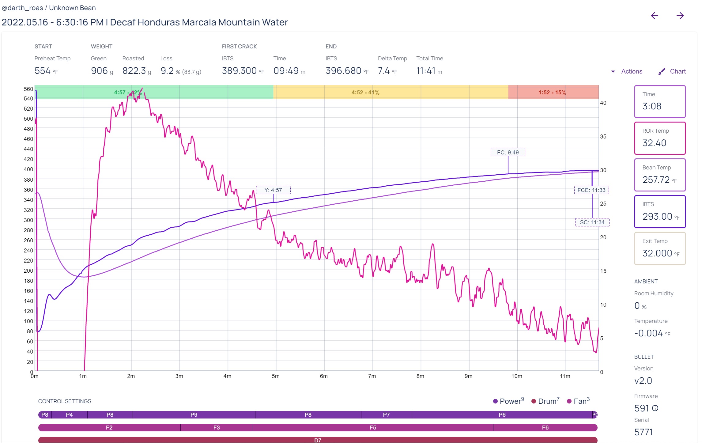
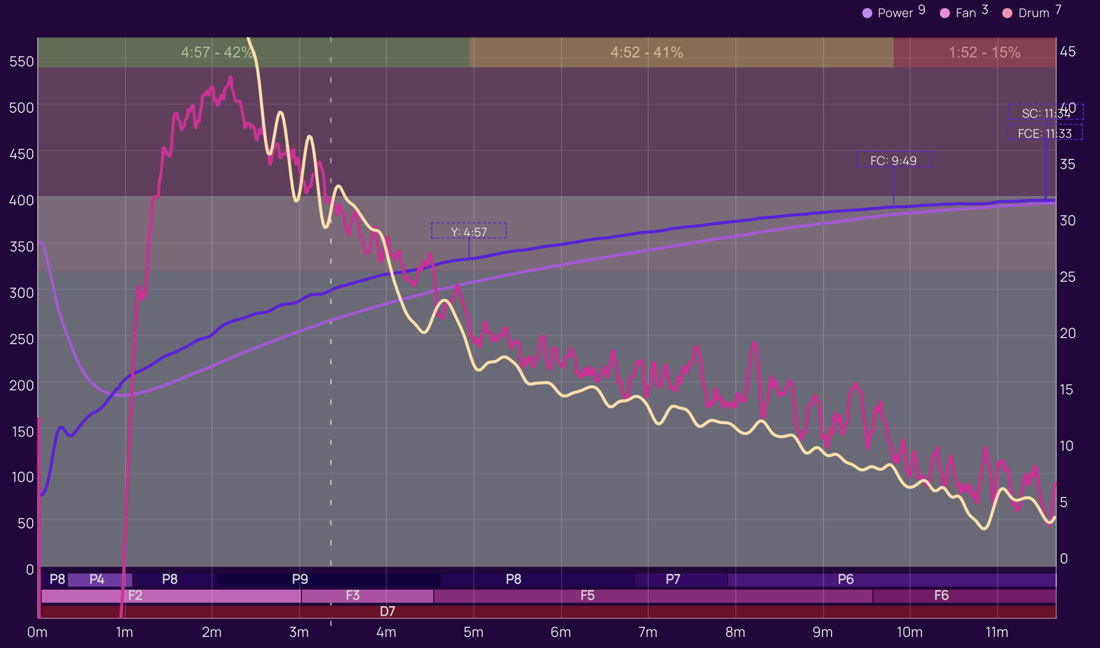
Here is my last roast from RoasTime (correct BT ROR IMO) and Roast World (BT ROR much lower).


Thanks, @geoffrey. From what I can tell, it seems that the I-RoR and B-RoR are both graphing as expected. The issue seems to be caused by the difference in Y1 axis between the two screenshots.
Either way, I’ll working on getting this to display better. ![]()
Hi Derrick,
I confirmed the settings for chart defaults in RoasTime in Celcius. After doing so, I switched to Fahrenheit so you can see what that is showing when it’s switched from Celcius (Fahrentheit is the temperature I normally use with roasting).
You can see from the screenshots, the ROR is off axis regardless. This also is showing up this way in RoastWorld.
It seems like something odd happens when you choose Fahrenheit instead of Celcius. All I did was select it and the settings updated to what you see below.
Thoughts?
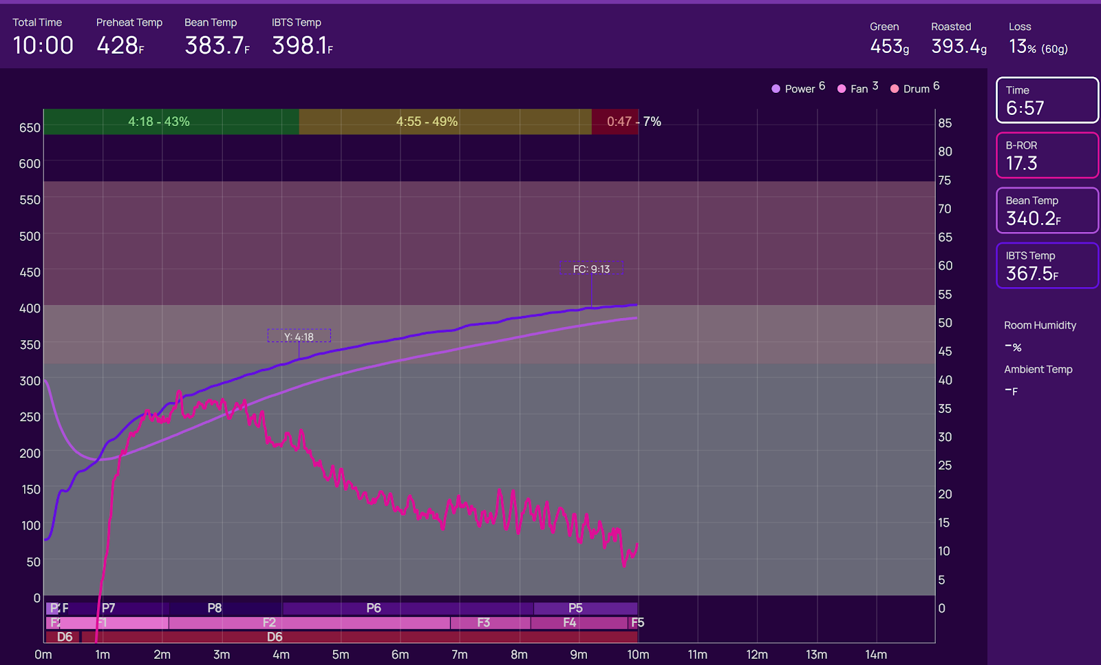
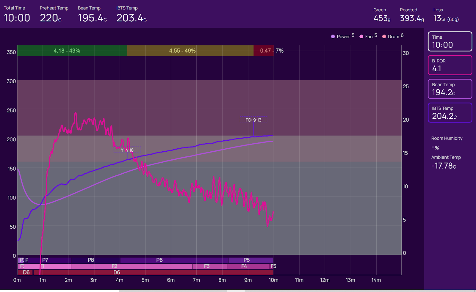

Thanks for looking at the graphs. I’m not sure I understand though.As I see it, peak ROR on RoasTime is about 37 or so and Roast World it is about 21.
Hi Derrick, I just wanted to confirm you saw my last message. I had responded via email originally but sent again through here. Please let me know if you have any questions.
1 Like
Hey @coffeethatrocks,
Thanks for your previous message. Yes, I’m aware of them. Sorry, I was out sick. Will get to it asap.
Best regards,
Derrick
Hi Derrick
I’m glad you’re feeing better and we certainly appreciate your help. This graphing error is not a big deal but it is annoying.
Quick experiment to show the problem. Take any roast you have handy. Put the cursor on a random time during the roast, lets say 3 minutes. Note the BT and IBTS temperatures. Move the cursor forward 1 minute to 4 minutes of the roast. Again note the temperatures of the BT and IBTS probes. The rate is degrees F per minute for each probe. That number on the traces of BT and IBTS is correct and calculated correctly on RoasTime Y axis. On RoastWorld, however, the Y axis value you got for that 1 minute interval is incorrect and a bit over 50% of what the little experiment above proves. Something is off in the Y axis value in RoastWorld graphs.
Thanks for the help.
Thanks for the feedback everyone! I found the issue and will push a fix asap. As @geoffrey mentioned, there was an error with how the RoRs were being calculated.
Let me know if this works on your end.
Regards,
Derrick
2 Likes
I’m still experiencing issues
1 Like
Hi @coffeethatrocks, can you confirm whether your issue is happening both on Roast World and RoasTime? The issue I had fixed should have only impacted RW. So if you’re experiencing yours on both, it might be a different issue.
I’ll look into your first comment again to see if I can figure out what’s wrong.
Regards,
Derrick
1 Like
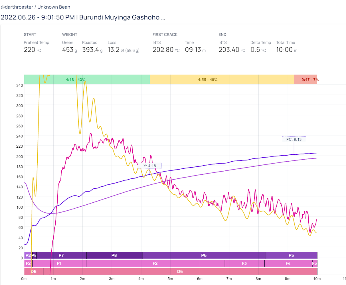
In the past when I would look at my roasts they appeared like this (in both Roast Time and Roast World
Now the roasts appear like this (in both Roast Time and Roast World)

The ROR starts well below the chart and the chart only shows the minutes where I roasted compare to the first picture I uploaded.
Thoughts?
Hey @coffeethatrocks, do you mean how in the first picture the RoR is from 500 on the Y1 axis (around 40 on the Y2 axis) and then drops down to below zero and then starts to come back up around the 1minute mark?
If this is the issue you’re facing, I’d say this is more a bug fix than a new bug. Originally on RW, the starting second was a spillover from the pre-heating phase and that’s why there’s the drop. Since the chart chooses the highest points as the values for Y1 and Y2 (while taking into consideration your chart configs) fixing the bug where there was spillover from the pre-heat phases might cause the charts to look different as the new “max y1 and y2” would be different.
If you’d like to keep the original behavior, I’m able to recreate the first image you attached by setting my RoasTime chart settings to the following:

Here’s a breakdown of how this looks:
Roast World

Roast Time
Let me know if this fixes your issue. If I missed the actual issue you’re describing, please let me know. I’d say this change is necessary as it brings both the RoasTime and Roast World graphs in parity in look/behavior.
Best regards,
Derrick
Hi Derrick,
The chart adjustments worked. The ROR still starts below the chart but otherwise this looks good. Thanks so much for your help.
Best,
Jeff
1 Like