Hey all – it’s been a long time since I’ve posted anything to the forum or to the Slack channel because everything has been working so very well for so very long! But as of my roasting session today, the interface that was honed over years with all the feedback has suddenly changed, and in my opinion very much for the worse… I hope this the appropriate place to give feedback (the Slack channel seems to no longer exist).
For context, I roast on an R1 on Windows, exclusively using overlays of past roasts. V4.14.3.
The changes that are messing up my workflow the most are:
- Vertical resolution of graph: for tracking temperature changes the vertical resolution is vital. If you are roasting with overlay, the power/fan/drum UI is now taking up too much space at the bottom of the screen, while the bean name and phases are also taking up excess space above the graph. The combined result is compressing the graph vertically and making it harder to see the trends of the current roast. I already have my maximum Y-axis dialed down as low as I can. I’ve uploaded a screenshot of how it appears on my screen.
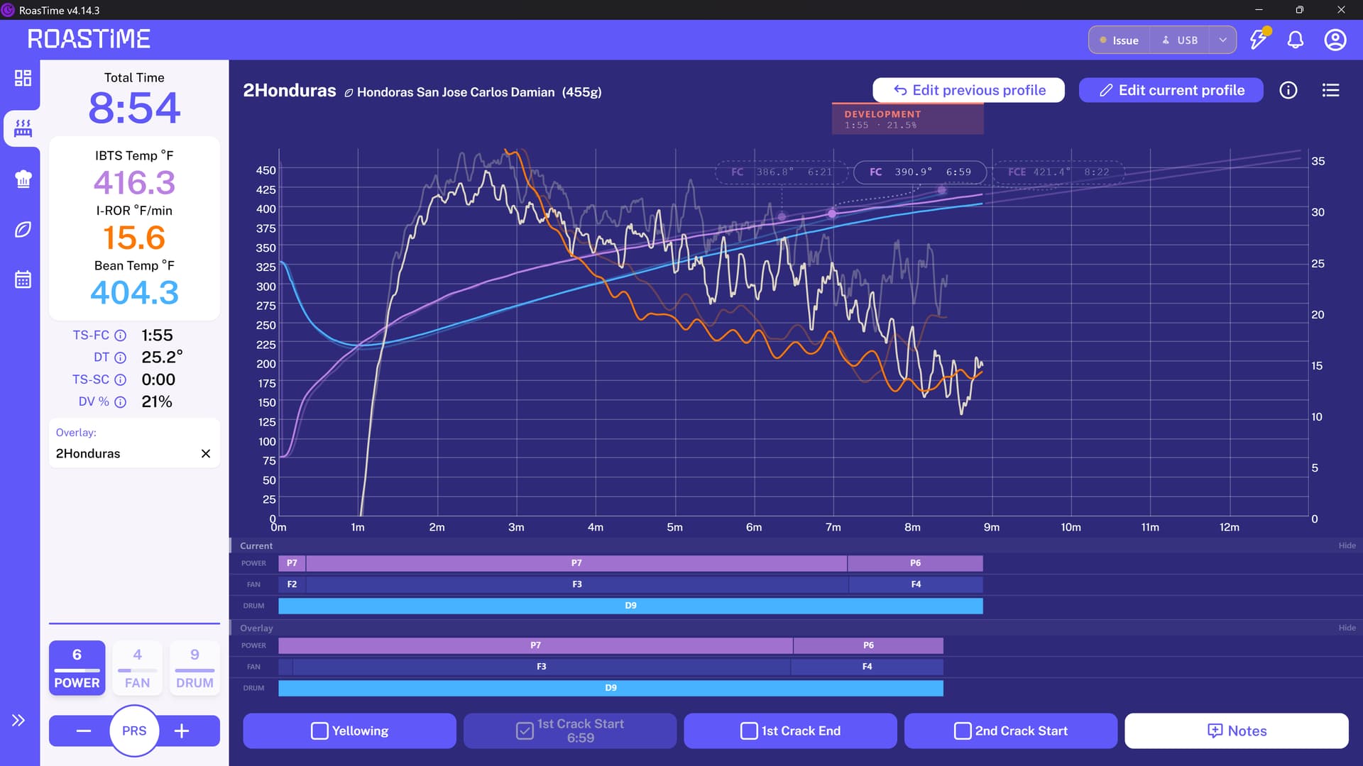
solutions might be allowing a minimum Y-axis larger than 0 as I’ve suggested in the past, removing white space, or even giving the user control to turn off elements? I never touch the drum speed and don’t need to see it.
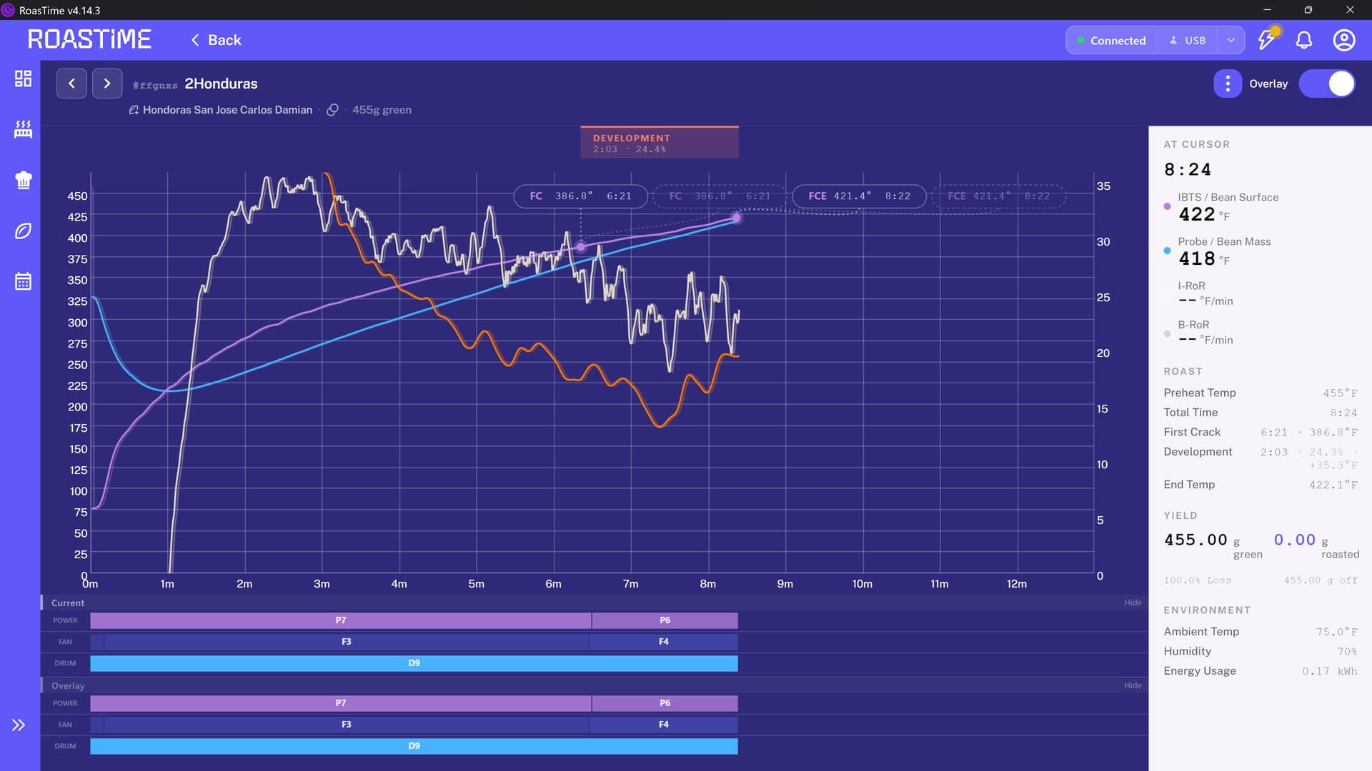
- When looking at a past roast profile, all the most important information about that roast-- first crack, development, end temp, total time - is now in a tiny deprecated hard to read grey-on-white font. The less important information is in a giant black font. See second screenshot.
- The new Smart Prediction UI… is a bit of a mess. The old one worked perfectly, with a few circles showing where the roast might be going. The new one adds time and temperature bubbles which crowd over everything, and worse, obscure the FC and FCE numbers from the past roast which I need to see. This is a feature I was using but now have to turn off because of the UI. I couldn’t get a screenshot of this because I needed it off while I was roasting.
On a positive note, the representation of the FC and FCE from the old roast is cleaner and nicer
I hope someone will take this feedback from a long-time Aillio customer and supporter. As a former software developer I understand change is sometimes necessary, but it also needs to be balanced with the important mantra (which may not translate) “if it ain’t broke, don’t fix it.” Thank you!