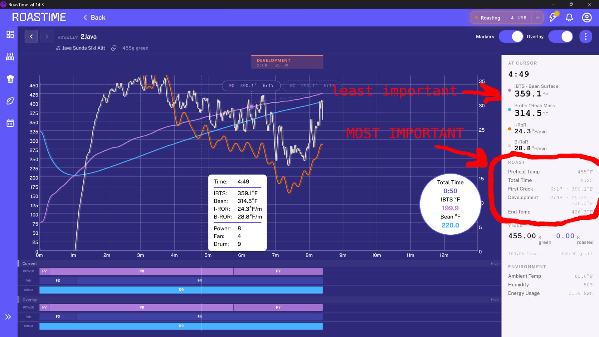
Hey all – it’s been a long time since I’ve posted anything to the forum or to the Slack channel because everything has been working so very well for so very long! But as of my roasting session today, the interface that was honed over years with all the feedback has suddenly changed, and in my opinion very much for the worse… I hope this the appropriate place to give feedback (the Slack channel seems to no longer exist).
For context, I roast on an R1 on Windows, exclusively using overlays of past roasts. V4.14.3.
The changes that are messing up my workflow the most are:
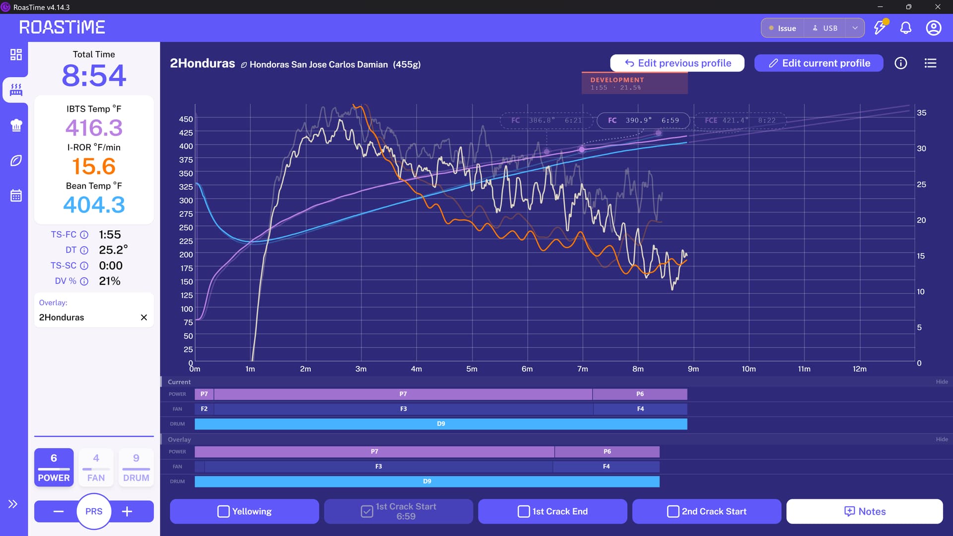
Vertical resolution of graph: for tracking temperature changes the vertical resolution is vital. If you are roasting with overlay, the power/fan/drum UI is now taking up too much space at the bottom of the screen, while the bean name and phases are also taking up excess space above the graph. The combined result is compressing the graph vertically and making it harder to see the trends of the current roast. I already have my maximum Y-axis dialed down as low as I can. I’ve uploaded a screenshot of how it appears on my screen.
solutions might be allowing a minimum Y-axis larger than 0 as I’ve suggested in the past, removing white space, or even giving the user control to turn off elements? I never touch the drum speed and don’t need to see it.
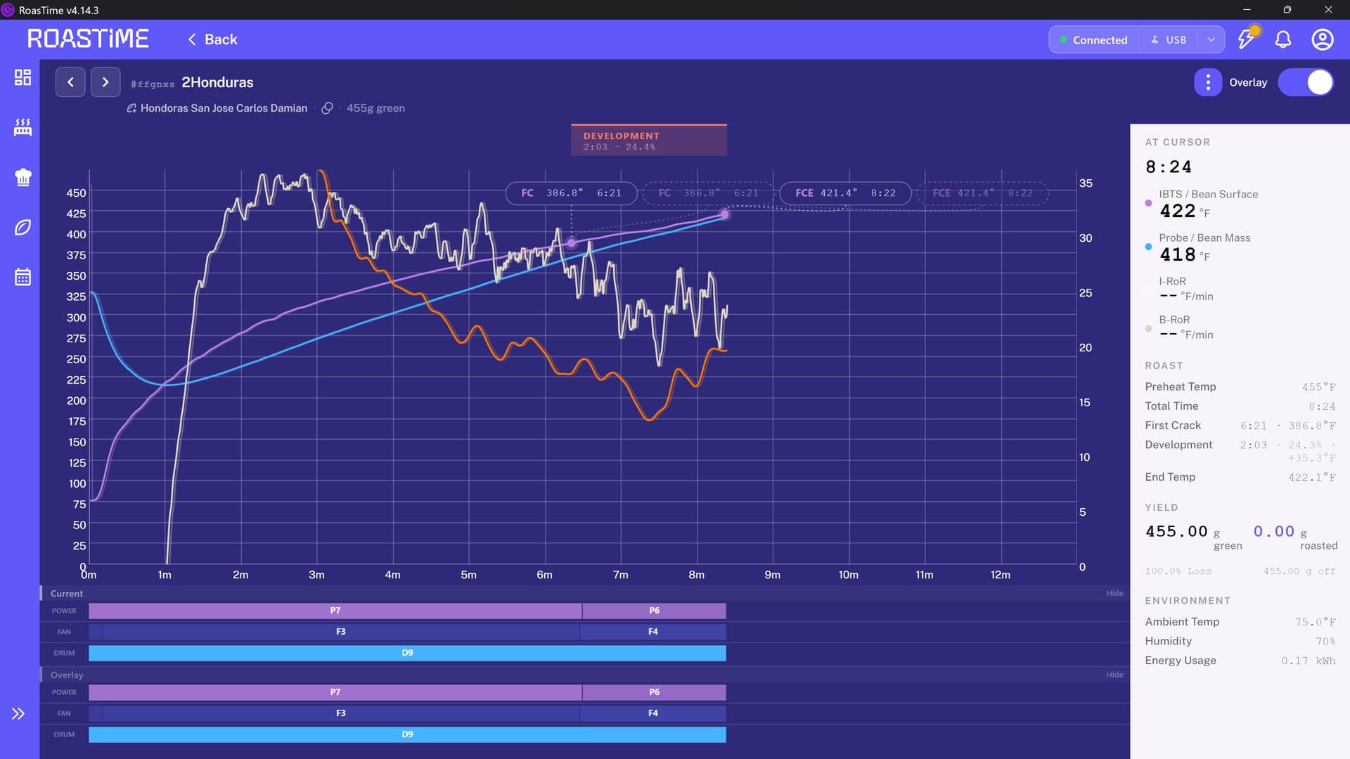
When looking at a past roast profile, all the most important information about that roast-- first crack, development, end temp, total time - is now in a tiny deprecated hard to read grey-on-white font. The less important information is in a giant black font. See second screenshot.
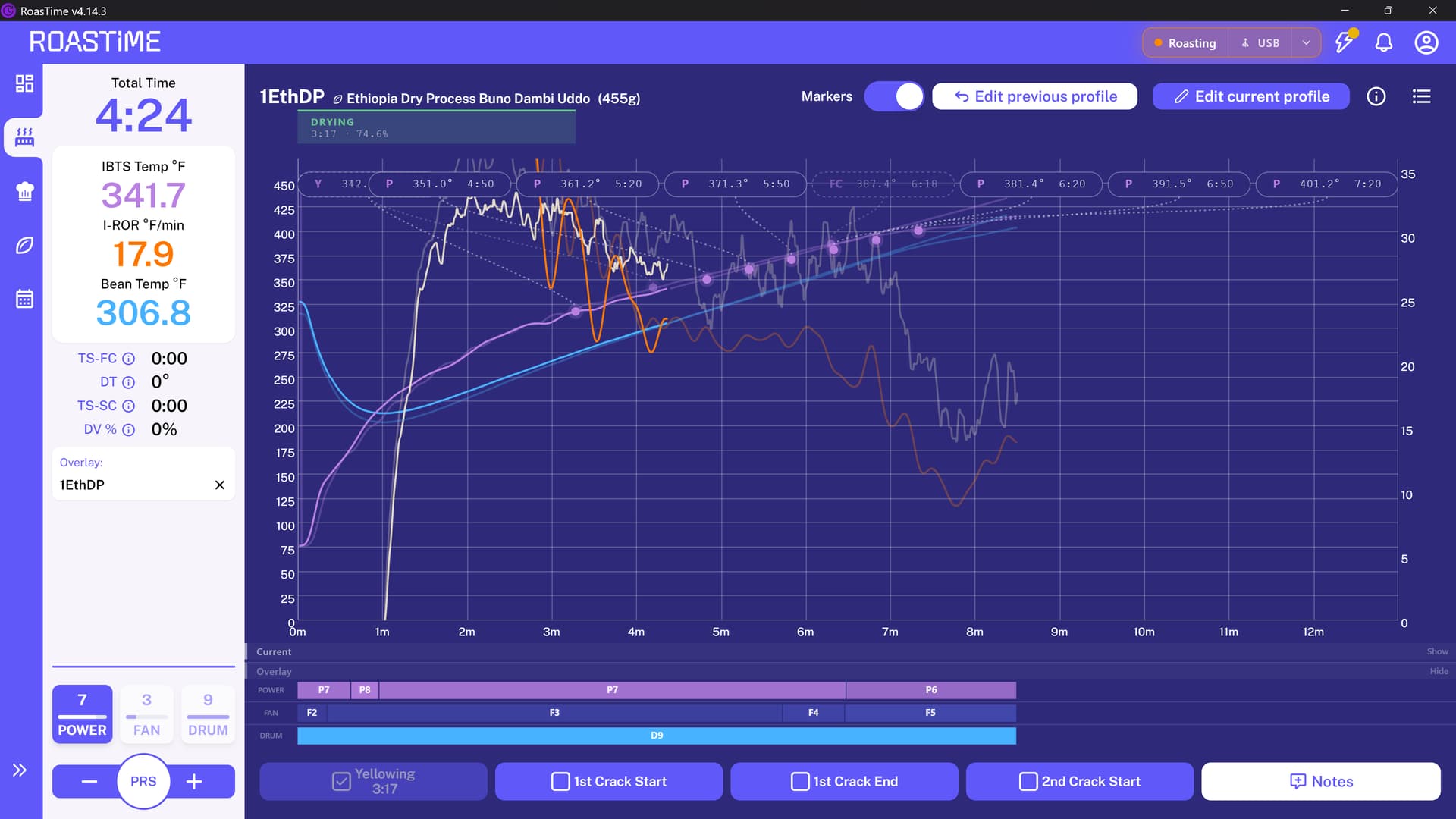
The new Smart Prediction UI… is a bit of a mess. The old one worked perfectly, with a few circles showing where the roast might be going. The new one adds time and temperature bubbles which crowd over everything, and worse, obscure the FC and FCE numbers from the past roast which I need to see. This is a feature I was using but now have to turn off because of the UI. I couldn’t get a screenshot of this because I needed it off while I was roasting.
On a positive note, the representation of the FC and FCE from the old roast is cleaner and nicer
I hope someone will take this feedback from a long-time Aillio customer and supporter. As a former software developer I understand change is sometimes necessary, but it also needs to be balanced with the important mantra (which may not translate) “if it ain’t broke, don’t fix it.” Thank you!
Thanks for posting about this…I have to agree 100% with your assessment and disappointment.
The vertical resolution is a huge bummer, and the past roast profile display is essentially unreadable, especially when I’m in a hurry to quickly verify DTR or end temp and get back the the primary roast curve.
(I don’t use the smart predication so can’t add anything there)
I just did my first roast with the updated UI today and my biggest concern is the fact that the Bean Temp Probe appears to be reading 10 DegC lower than previously. This is a major issue when trying to replicate previous roasts manually.
Doesn’t look like I’m having that particular issue. I just compared a roast from last week when I started this thread and one from May, the bean temperature curve is nearly identical.
No, no recent cleaning and no other changes in last few months. Nothing to explain the changes I am seeing other than the latest software update. The changes have even affected the Pre-Heat behaviour. For the same Pre-Heat temperature setting, the resultant Bean Probe Temperature is about 5 DegC lower than before the software changes were implemented.
I think it is a deliberate design perhaps to protect the IR sensor during high Pre-Heat settings. Would love for someone from Aillio to comment or provide some clarity. I can’t be the only one experiencing this. It was a step change in behaviour after the software update.
I’ve made a post about it, but that was the firmware that introduced F1 during preheat. I don’t know if we’re talking about the same thing but it’s worth mentioning. Here’s my question and underneath there’s an explanation by da_kevin.
I like most of the changes but the post roast information is hard to read because of the light and small fonts , I couldn’t figure out a way to improve the fonts
Thank you Braca, this was most helpful. I did notice the Fan is now at F1 during preheat after the software update.
What is most puzzling to me is why this happened to me just now when the software change Aillio was talking about in your post was from a year ago.
I have been updating my software promptly and regularly since buying my R1 and this F1 change at preheat stage never applied to my machine until just a few weeks ago. Super weird
I can see where this would be a handicap. I am currently using a 16x10 monitor (1920x1200) which gives me more vertical resolution than a standard 16x9 monitor (1920x1080), so it doesn’t affect me as much. Still, the good folks at Aillio should consider a workaround such as putting the power, drum and fan values on the actual graph itself, but below the 150 DegF line where they won’t be blocking anything, thus allowing the graph to be extended all the way to the bottom. They could use semi-transparent colors that would allow the ROR lines to show through.
I agree and came here to see if there is a way to turn off the prediction bubbles. I have a large monitor and they still crowd out everything like you say and completely make the FC unreadable. Is there a way to turn off these prediction traces and bubbles? Very annoying.
Just as an update to this matter.
there was another software update when I came to roast yesterday and it appears to have addressed the issue I was experiencing after the previous software update. The machine is now behaving normally
Hi - I’d just like to update this thread regarding the UI changes, which was its original purpose.
First off I appreciate the ability to hide/show the current and overlay power/fan/drum, it improves the vertical resolution issue. I still feel my earlier suggestions could continue to make this even better.
I appreciate the addition of the “Markers” toggle since I started this thread, but it does not address that issue.
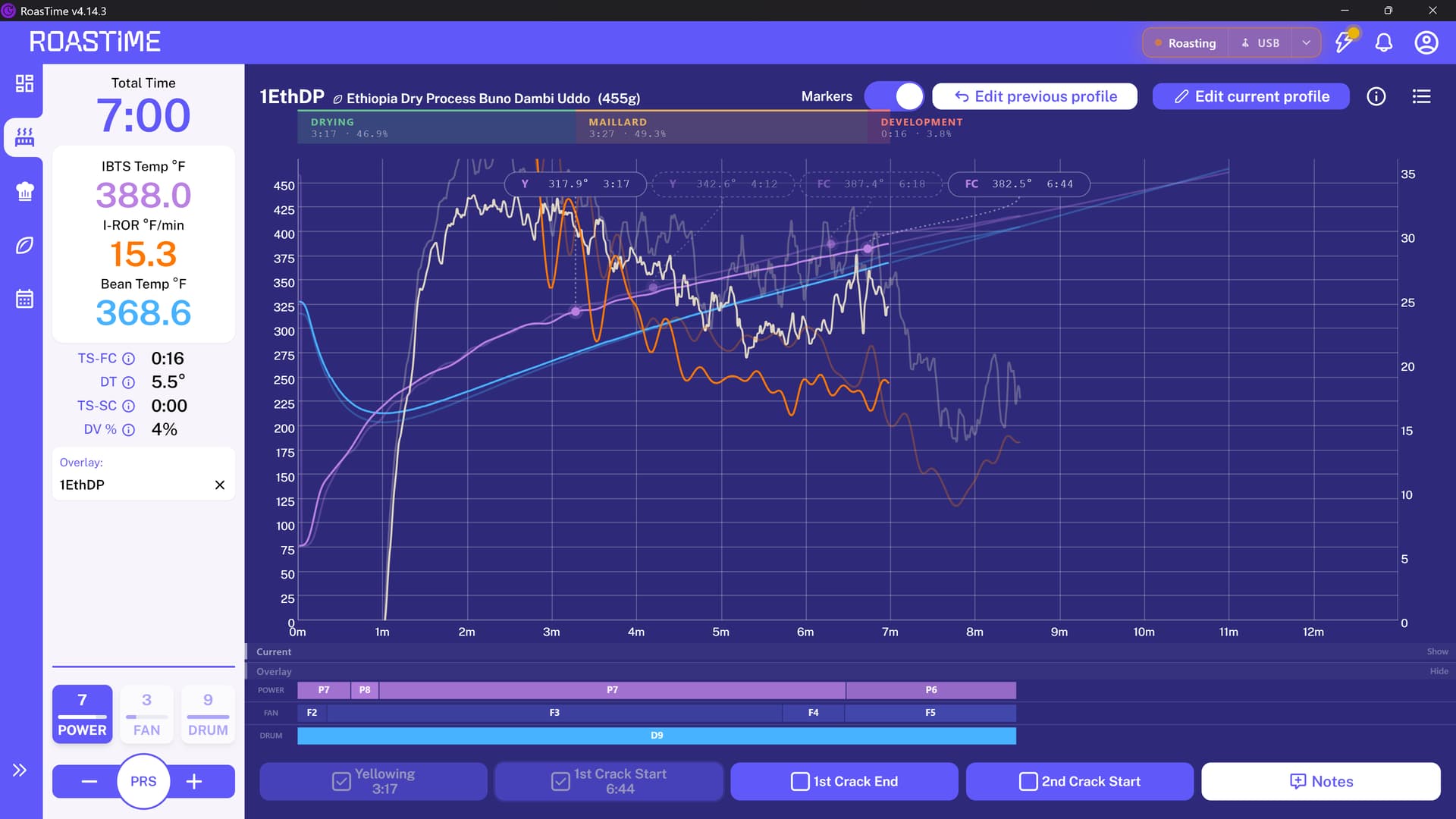
I have been using the Smart Prediction (IR) feature of RoastTime since it was introduced and I’ve found it very useful, but the markers have made this feature unusable.
Markers/labels are desirable, and I would argue necessary, for the OVERLAY. It is important to see the REAL time/temperatures from the past roast. I find the new design for this is really nice:
But markers/labels are UNDESIRABLE for the Smart Prediction. The overlaid dots are useful because they are guessing possible future time/temperatures, but because they are GUESSES, they should not be labelled with precise values. They clutter the display, rendering the REAL time/temperatures unreadable and even overlapping them at times. This is what that now looks like:
So the new Markers toggle button is not helpful, because it just turns off all markers, good and bad. In my opinion the markers should be permanently - or at least separately - turned off for the Smart Prediction only.
Additionally the most important data from the past roasts is still presented in the smallest, lightest fonts while the least important information is in large, bold fonts.
You’ve given a very clear overview of the things you like and dislike about the new U.I. and I hope Aillio is watching this thread. I took a stroll back down memory lane a few days ago by loading an old version of roasttime onto my computer. The old display was definitely better laid out. I now wish I could keep that display, but with forced updates it isn’t possible. I understand Aillio wanting to establish a “look” of their own, but they could take a page from Artisan and allow users to change the “look” a little to suit individual tastes.
Thanks, I tried really hard to make it as clear as possible. I agree, the old RoastTime got that way through a long, iterative process with user feedback along the way.
I do commend whoever is working on it now for adding some of those customization choices, there are more user UI prefs than before. There is an option now to prevent automatic updates, which I may well enable next time the UI gets to a stable place. Hopefully it’s be a one step back, two steps forward situation.